Task Analytics - Task Management Solution
Task Analytics is one of the most powerful features in CentriQS, yet for some users it may seem a bit complicated at first glance. In fact, task analytics is a very convenient way of creating intelligent, informative and flexible summary tables to interpret data in different ways just by dragging and dropping table columns and rows to different positions. You will definitely benefit from using task and project analytics, because it helps you quickly summarize and analyze large amounts of data, make comparisons and discover important trends, figure out various relationships and give you insights into your business data.
What is Task Analytics?
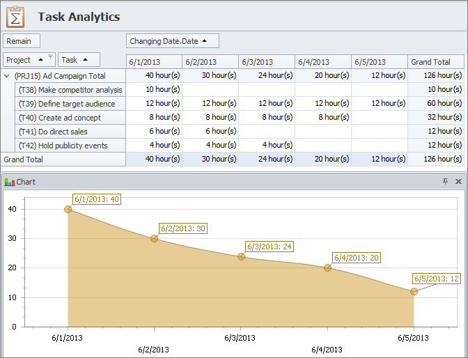
Task analytics can answer essential questions such as “Who is our highest-performing employee?”, “What tasks or projects are ‘At Risk’?”, etc. For that purpose CentriQS features Task Analytics view with dynamic Pivot table which queries Task Analytics OLAP cube to extract, organize and summarize the data.

Pivot Table
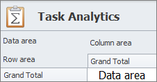
CentriQS Pivot software feature automatically sorts, counts, and totals the information about your tasks and projects. Users can easily rearrange the table with the drag of the mouse to pivot (i.e. turn) the information around in order to see it from different angles. The table consists of data area, row area, column area and filtered area. Also there is a chart panel for interactive visualization of data in selected cells of Pivot table.
Data Area
Data area displays task properties you need to measure. Default task measures are such task properties as ‘Estimate’, ‘Actual’, ‘Remain’, ‘Deviation’, ‘Number of Tasks’, and ‘Completed’. For example, you can display task property ‘Number of Tasks’ in data area to see how many tasks are there in the database.

Row Area
Row area lets organize data by rows. For example, you can display task property ‘Assigned To’ in row area to see how tasks are allocated among employees.

Column Area
Column area lets organize data by columns. For example, you can display task property ‘State’ in column area to see how many tasks have ‘Created’, ‘In Progress’ and ‘Closed’ status.

Filtered Area
Filtered area lets show or hide particular data. For example, you can display task property ‘Project’ in the filtered area to see how many tasks belong to certain project(s).

Pivot Chart
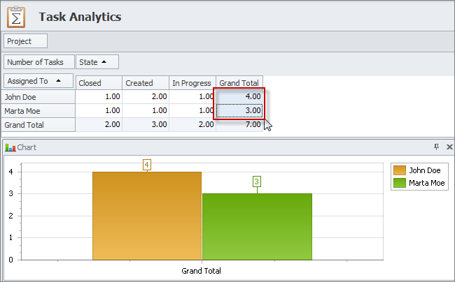
Charts panel lets display analytics data as diagram. For example, you can select cells of the column ‘Grand Total’ and rows ‘Assigned To’ to compare the number of tasks assigned to each employee.
Pivot Table Layout Settings
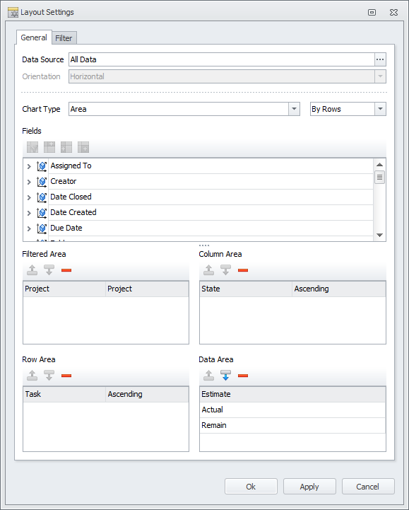
Layout settings help users select what data Pivot table will display and how it will be organized. Users can setup and save table layouts as presets for quick shifting between the required interactive reports and analytics.
Base Field
Base field is the task property of “date and time” data type which is used as base point for building task analytics table.
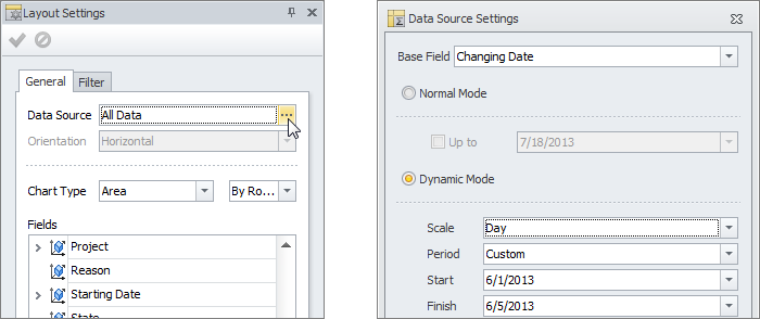
Normal Mode
Normal mode lets you display task analytics up to the current date and time or up to a certain date in the past. For example, you can see how much time remains till project completion now or how much time remained till project completion yesterday.
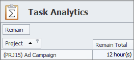
Dynamic Mode
Dynamic mode lets you display task analytics for a certain period for tracking the changes and discovering trends. For example, you can see how time remaining till project completion changed during this week.

Chart Type
Chart type lets you choose a required chart from a variety of types and specify whether data should be shown by columns or rows. For example, you can select Area type to build a burndown chart for your project.
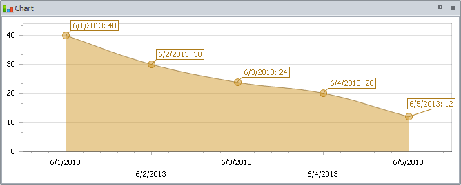
Fields
Fields are task measures and dimensions which are used to break down the data you want measure. For example, you can see time remaining till project completion broken down by tasks of the given project.
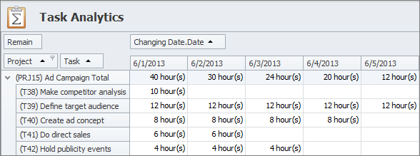
Areas
Areas are the boxes where you can drag’n’drop task fields to display them on Pivot table. Task measures can be moved to Data Area and Filtered Area, while task dimensions can be moved to any of Row, Column or Filtered Area. For example, you can put Deviation to data area and Project to Row area to see which project is behind schedule or over schedule.

Filters and Presets
Filters let you hide or show certain data by setting simple or complex filter conditions. Layout is the position and sorting of the fields displayed in the Data, Row, Column or Filtered areas. Presets are pre-saved layouts and filters of the Pivot table which are frequently used. For example, you can save filter that shows only active tasks (which are not in ‘Closed’ state) and select it whenever you need without setting filter condition.
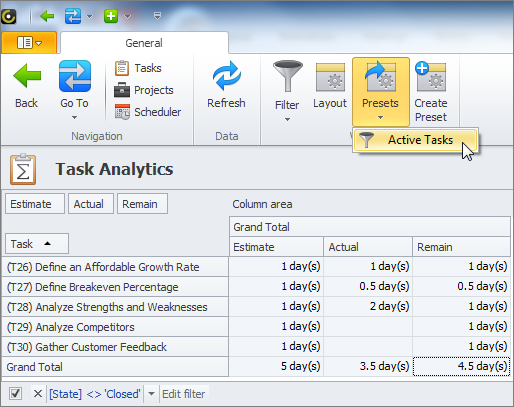
Learn how to use Task Analytics
Prev.: Task Printing & Exporting || Next: Task Analytics Charts
Next steps
{
Check out Task Management FEATURES
Watch Task Management Solution VIDEO OVERVIEW
Learn how to manage tasks in KNOWLEDGE BASE
DOWNLOAD CentriQS 30-day Free Trial Version
CONTACT US to get help with Task Management Solution